


You're probably in a familiar spot. The phone rings some weeks, then goes quiet. You're getting traffic to your site, or at least enough that you know people are finding you, but too many of those visitors vanish without calling, filling out a form, or asking for a consultation.
That's frustrating when you build high-value projects. A homeowner planning a kitchen, addition, or whole-home remodel isn't buying a T-shirt. They're choosing who gets access to their home, their money, and months of their life. Your website has to do more than “look nice.” It has to build trust, remove confusion, and make the next step feel safe.
If you want to learn how to improve website conversion rates for a remodeling company, start with this simple idea. More traffic helps, but it isn't the whole game. A widely cited benchmark says the average website converts about 2.35% of visitors across industries, while top-performing sites can reach 11% or higher. Organic search traffic often converts in the 2% to 4% range, which is one reason conversion work matters so much for service businesses (conversion rate benchmarks from Keywords Everywhere). When more of your current visitors turn into real inquiries, your marketing starts pulling harder without needing a flood of new clicks.
Table of Contents
- Your Website Is a Leaky Bucket Find Where You're Losing Leads
- Quick Fixes That Boost Conversions Almost Overnight
- Build Unshakeable Trust Before You Even Meet
- Create Offers That Get Homeowners to Take Action
- Connect Your Website to Your Sales Process Automatically
- Measure What Matters and Test for Better Results
Your Website Is a Leaky Bucket Find Where You're Losing Leads
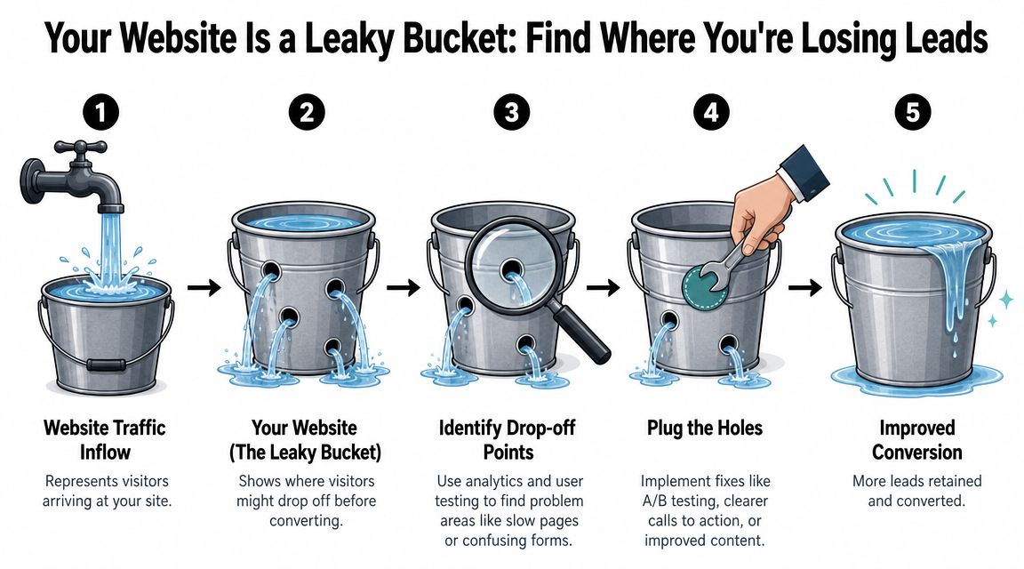
Most remodeler websites don't have a traffic problem first. They have a leak problem.
Think of your site like a bucket under a faucet. Traffic is the water going in. If the bucket has holes, more water won't solve much. You can keep paying for SEO, Google Ads, Local Services Ads, yard signs, referrals, and social content, but if visitors hit confusion, slow pages, weak trust signals, or clunky forms, they leak right out.
A strong conversion process starts with evidence, not random redesigns. That's the right order because weak experiments happen when owners change colors, photos, and layouts before they've proved what's broken in analytics. CRO methodologies from Conversion Rate Experts and others put evidence gathering before testing for exactly that reason (CRE methodology for evidence-first CRO).
Start with the pages that should produce leads
Don't audit every page at once. Start with the pages where a serious homeowner should be raising their hand.
That usually means:
- Homepage: Does it clearly say what you do, where you work, and what type of projects you take on?
- Service pages: Kitchen remodeling, additions, bath remodels, outdoor living, whole-home renovations.
- Project gallery: Are people staying and clicking deeper, or bouncing?
- Contact page: Do people start the form and disappear?
- High-intent landing pages: Pages tied to Google Ads, branded searches, or “near me” searches.
Open Google Analytics and look for simple clues. Which pages get traffic but don't lead to contact-page visits? Which pages have strong traffic from search but weak engagement? Which pages lose mobile users faster than desktop users?
Practical rule: Don't start by asking, “What should the site look like?” Start by asking, “Where are serious homeowners getting stuck?”
If your mobile experience is rough, that's often one of the first leaks to plug. Small screens punish clutter, tiny buttons, and heavy image files. This guide on mobile optimization in web design is worth reviewing if your site feels harder to use on a phone than it should.
Use simple tools to catch real behavior
Numbers tell you where a leak might be. Behavior tools help show why.
A basic toolkit is enough:
- Google Analytics for traffic, landing pages, and conversion paths.
- Heatmaps to show where visitors click, scroll, and ignore.
- Session recordings to watch real visits on key pages.
- Form tracking to see where people abandon the process.
Here's what to look for in plain English:
| Problem you see | What it usually means |
|---|---|
| Visitors land on a page and leave fast | The page didn't match what they expected |
| People click things that aren't clickable | The design is sending mixed signals |
| Most users never scroll far | Your best proof is too low on the page |
| Form starts but few submissions | The ask feels too big or too annoying |
When you watch recordings, don't try to review everything. Watch a small set of sessions from people who reached an important page and then left. Patterns show up quickly. Maybe they hesitate over the CTA. Maybe they jump between gallery and pricing clues. Maybe they hit a long form and quit.
That's how to improve website conversion rates without guessing. Find the hole first. Then patch that hole.
Quick Fixes That Boost Conversions Almost Overnight
Some website problems need a full rebuild. Many don't.
A lot of remodelers can improve conversion just by fixing the first few seconds of the visit. That's where homeowners decide whether your company feels clear, credible, and worth their time. If those first seconds feel muddy, they leave before your craftsmanship even gets a chance to speak.
Fix the first impression
Start with page speed and page clarity.
If a homeowner taps your site from a phone while standing in a driveway, sitting at work, or comparing contractors on the couch, patience is thin. Heavy images, bloated sliders, autoplay video, and cluttered scripts make the site feel slow and annoying. Even if the exact delay changes from page to page, the effect is simple. Slow pages lose attention.
Your first-action checklist should look like this:
- Compress large images: Your kitchen photos can still look good without loading like giant print files.
- Cut homepage clutter: Remove rotating banners, stacked popups, and sections nobody uses.
- Make the top CTA obvious: A visitor should know where to click without hunting.
- Check the mobile menu: If it's messy, homeowners won't dig.
A slow, confusing page doesn't just hurt user experience. It hurts trust. People judge your process by your website. If the site feels disorganized, they assume the project might too.
For more ideas on the structure of a high-performing contractor site, review this guide on how to design a remodeling website that converts visitors into leads.
Tighten the message
The second fast win is messaging. Most remodeling websites say what the company does, but not why the right homeowner should care.
“Kitchen Remodeling” is not a strong headline. It's a label.
A better headline gives a homeowner a reason to stay. It speaks to the project type, location, and quality level you want to attract. It sounds like this:
- Award-winning kitchen remodels for homeowners in [City]
- Design-build additions for growing families who want more space without moving
- Custom bathroom renovations built for comfort, storage, and long-term value
A weak headline makes the visitor do the work. A strong headline does the work for the visitor.
You also need supporting copy under the headline that answers basic questions fast:
- Do you serve their area?
- Do you specialize in the kind of project they want?
- Do you handle design, build, or both?
- Are you the kind of firm that takes premium projects seriously?
Here's a simple comparison:
| Weak copy | Better copy |
|---|---|
| Home Remodeling Services | Custom home remodeling for homeowners in [City] seeking thoughtful design and high-quality construction |
| Contact Us Today | Schedule a design consultation |
| We do kitchens, baths, and additions | We design and build kitchens, bathrooms, additions, and whole-home remodels for homeowners who want a guided process |
Good conversion copy is not clever. It's clear.
If you only make two changes this week, make the top of your key pages faster and clearer. Those fixes often do more than another month of tinkering with colors and fonts.
Build Unshakeable Trust Before You Even Meet
For a high-value remodel, trust starts before the first phone call.
One remodeling website feels like a brochure. It lists services, drops in a few stock-looking photos, adds a short paragraph about quality, and ends with a contact form. Nothing on the page feels false, but nothing feels safe either.
Another website shows real spaces, real people, and a real process. The homeowner can see the craftsmanship, understand the type of work the company takes on, and picture what it might feel like to work together. That second site converts better because it answers the emotional question behind every major remodel. “Can I trust these people in my home?”
Two remodeling websites, two very different feelings
Site one says:
- Kitchen Remodeling
- Bathroom Remodeling
- Home Additions
- Contact Us
Site two shows a finished kitchen with strong photography, a short story about the family's goals, a note about the design challenge, and a clear explanation of the result. It includes a testimonial from a local client, names the town, shows the project scope, and introduces the team behind the work.
The second site doesn't just display projects. It lowers fear.
That matters because expensive remodels are high-consideration decisions. Homeowners aren't only comparing style. They're judging professionalism, communication, organization, and taste.
What trust looks like on a remodeler website
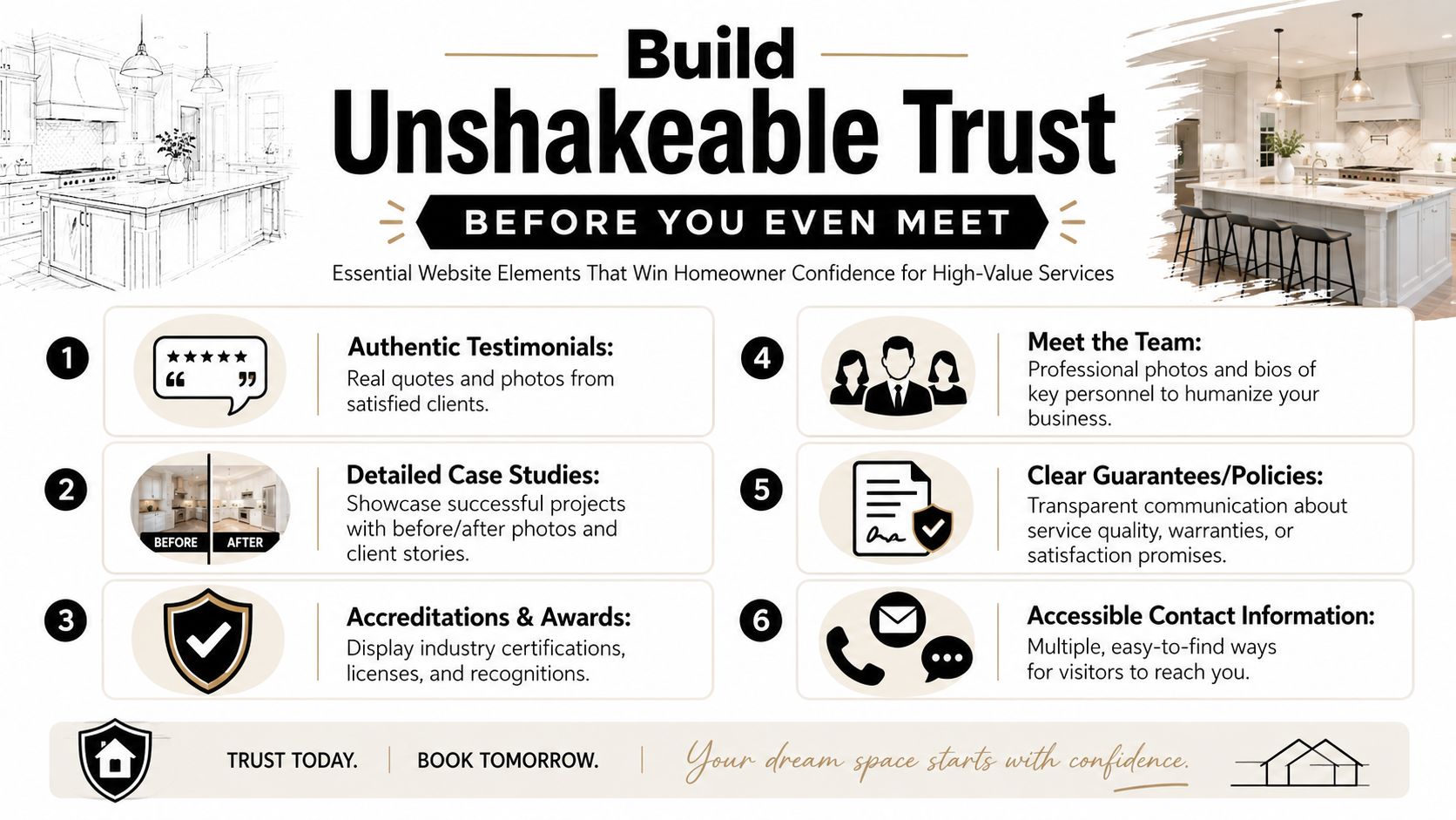
Trust isn't one badge at the bottom of the page. It's a stack of signals.
Use these signals where decisions happen, not buried in a footer:
- Project stories: Show before-and-after work if appropriate, but add context. What problem did the homeowner have? What did you solve? What changed in daily life after the remodel?
- Specific testimonials: “They were great” is weak. Better reviews mention communication, cleanliness, schedule handling, design guidance, and the finished result.
- Team photos: Real faces beat generic office stock photos every time.
- About page depth: Tell people how you work, what you value, and what kind of projects fit best.
- Proof of legitimacy: Licenses, certifications, awards, and associations help when they're real and current.
- Easy contact options: Phone, form, and email should all be simple to find.
Homeowners trust details. Vague claims sound like marketing. Specifics sound like experience.
One of the biggest misses I see is a gallery with beautiful images but no explanation. A prospect looking at a $75K to $300K project wants more than inspiration. They want proof that you understand scope, complexity, and execution. Add captions. Add location context. Add a short project summary.
A useful trust page set often includes:
| Page | What it should prove |
|---|---|
| Gallery | Your taste and project quality |
| Case study | Your process and problem-solving |
| About | Your people and standards |
| Testimonials | Your client experience |
| Contact | Your professionalism and responsiveness |
Another mistake is hiding the team. If you have a designer, project manager, estimator, or owner who regularly works with clients, show them. A short bio and professional photo can do a lot of work.
The best remodeling websites make homeowners feel like they already know what kind of company they're dealing with. That lowers resistance before the first conversation starts.
Create Offers That Get Homeowners to Take Action
Your call to action has one job. Give a homeowner a good reason to take the next step.
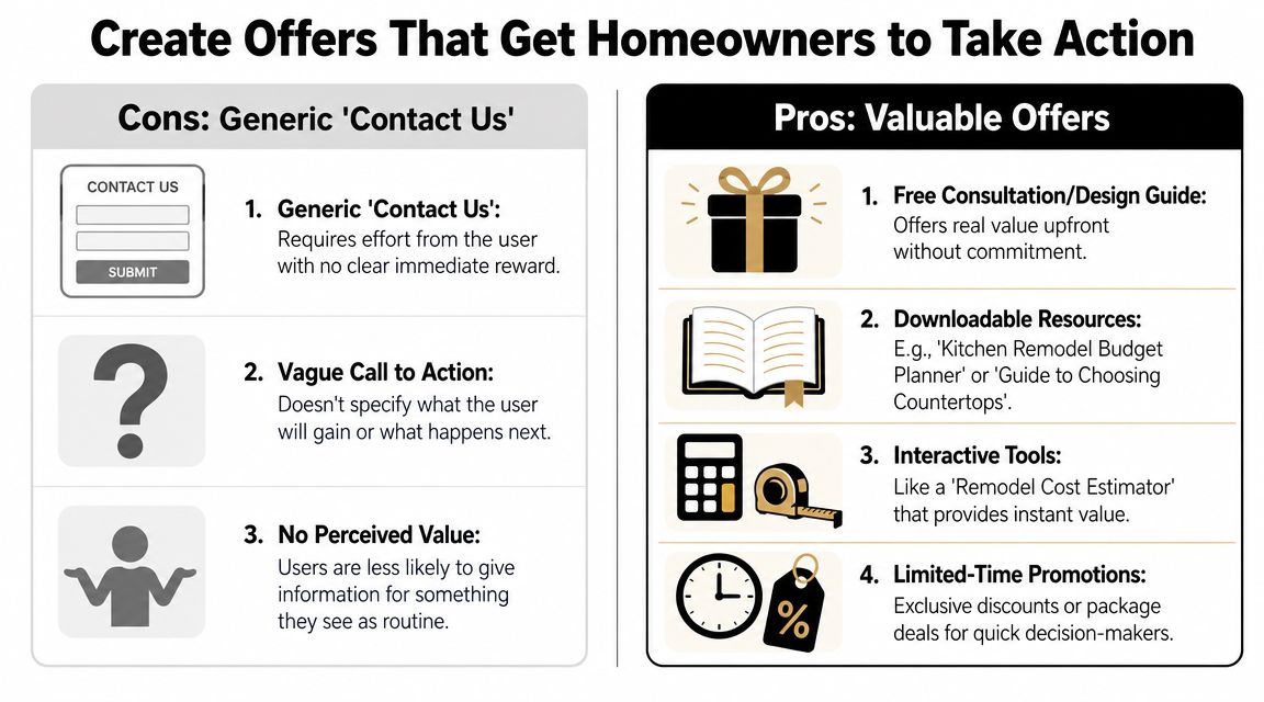
For high-value remodeling projects, that reason needs to match the decision they are making. A family considering a $150K kitchen renovation is not browsing for a quick price. They are trying to answer bigger questions. Are you the right fit for this kind of project? Do you work in their area? Do you handle design? What does the process look like? If your site only offers a blank contact form, many qualified prospects hold off.
That hesitation is normal.
Match the offer to the homeowner's stage
A strong CTA lines up with buyer intent. Someone ready to talk should see a clear next step. Someone still researching should see a lower-commitment offer that helps them evaluate your company without forcing a sales call too early.
For homeowners ready to start the conversation, effective CTAs include:
- Schedule a design consultation
- Request a project review
- Talk with our remodeling team
- Get started on your kitchen remodel
For homeowners still sizing you up, these offers usually work better:
- Download our kitchen planning guide
- Get our remodeling cost guide
- See what to expect during a design-build project
- Use our project fit questionnaire
The point is not to add more buttons. The point is to give serious prospects an offer that fits where they are in the decision process.
That matters even more for remodelers because a good lead is not just any lead. You want homeowners with the right project type, budget range, location, and expectations. A well-built offer helps pre-qualify before your team spends time chasing a bad fit.
Make the first conversion easy
Forms are a common drop-off point, especially on mobile. Baymard Institute's research on checkout and form usability repeatedly shows that extra effort and unnecessary fields increase abandonment, which is the same friction problem service businesses create when they ask for too much too soon (Baymard's form usability research).
For a remodeling website, the first form usually only needs enough information to start a useful conversation:
- Name
- Phone
- Project type
- Location
- Short project description
That gives your team enough context without turning the form into an intake packet.
If you need stronger qualification, add one smart screening question such as budget range or desired start timeframe. Keep it high level. Asking for exact measurements, finish selections, inspiration links, and full project history on the first touch usually lowers completion rates. I have seen remodelers lose good $100K-plus opportunities because the form felt like homework.
Button copy matters too. “Submit” is administrative language. Homeowners respond better when the button tells them what they are getting.
| Weak CTA | Better CTA |
|---|---|
| Submit | Request My Consultation |
| Contact Us | Start My Project Review |
| Send | Get in Touch About My Remodel |
A short form does not mean a sloppy process. It means the website handles the first step, then your team or your CRM software for builders handles qualification after the lead comes in.
Good offers remove uncertainty. Short forms remove friction. Put those together, and more of the right homeowners will reach out.
Connect Your Website to Your Sales Process Automatically
A website lead is only valuable if your team handles it well.
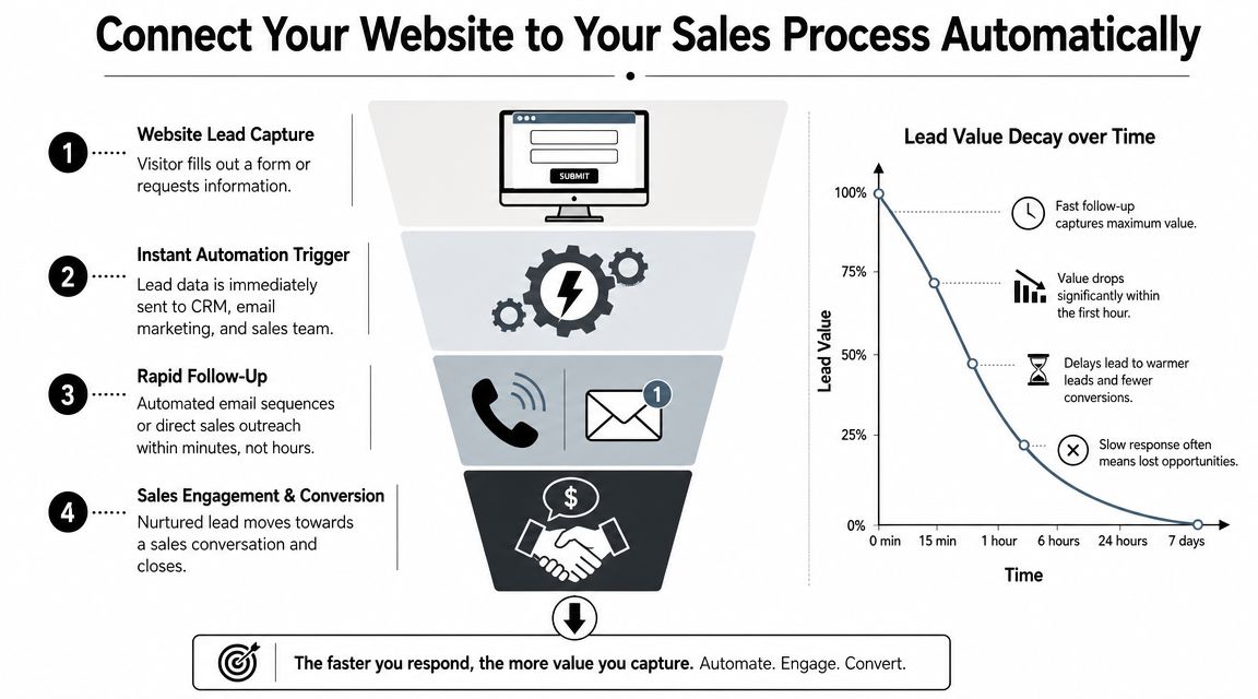
Too many remodeling companies work hard to get the inquiry, then lose momentum after the form is submitted. The message goes to a general inbox. Someone sees it later. A callback gets pushed to tomorrow. By then, the homeowner has already talked with someone else.
That handoff matters more than most owners think. Your website and your sales process are not separate systems. They're one system.
What should happen right after a form submission
When a homeowner fills out your form, three things should happen fast:
- They get confirmation immediately. Email, text, or both.
- Your team gets alerted right away.
- The lead gets logged in one place so nobody forgets it.
That immediate response does two jobs. It reassures the homeowner that their message went through, and it signals that your company is organized.
A simple confirmation message works well: thanks, we received your request, here's what happens next, and here's how we may contact you.
Simple automation makes you look buttoned up
Platforms like GoHighLevel are essential for contractors. They enable you to connect your website forms to a CRM, trigger instant text or email responses, route notifications to the right team members, and set up missed-call text-back if someone calls when you can't answer.
That creates a smoother experience for both sides. The homeowner feels acknowledged. Your office doesn't have to remember every follow-up manually. Your sales team sees lead status clearly instead of searching through email threads.
A practical setup usually includes:
- Instant confirmation text or email: Sent the moment the form is submitted.
- Internal notification: To owner, estimator, coordinator, or salesperson.
- Lead pipeline stage: New lead, contacted, consultation scheduled, estimate sent, closed won, closed lost.
- Missed-call text-back: If someone calls and nobody picks up.
- Task reminders: So warm leads don't drift.
Fast follow-up doesn't replace good sales. It protects good sales from sloppy handoffs.
If your current lead process lives in inboxes, sticky notes, and memory, tighten it up. This overview of CRM software for builders gives a good starting point for thinking about systems, not just websites.
The point isn't fancy automation for its own sake. The point is making sure the expensive lead your site worked to earn doesn't cool off while your team is busy on a jobsite.
Measure What Matters and Test for Better Results
A remodeling website can look polished, rank well, and still fail at the job that matters. If it brings in price shoppers, tire-kickers, or small-job inquiries your team does not want, the site is creating work, not revenue.
For high-value remodelers, measurement has to stay tied to sales quality. A kitchen project worth $150,000 and a handyman-level form fill should not carry the same weight in your reporting.
Track business outcomes, not website trivia
Start with a short scorecard your team can review every month:
- Qualified leads from the website
- Cost per qualified lead
- Consultations booked
- Sales opportunities created
- Projects won from web leads
- Average project value from web leads
Those numbers show whether your marketing is attracting homeowners who fit your project range, service area, and process. Traffic, pageviews, and time on site still have value, but they are diagnostic metrics. Use them to spot friction. Do not use them as proof that marketing is working.
A simple question keeps this grounded. Did the website produce more of the right conversations this quarter than it did last quarter?
Test changes that affect trust and intent
Remodelers usually do not have enough traffic to run endless button-color experiments. They do have enough traffic to test bigger decisions that influence trust, clarity, and lead quality.
Good tests for this type of site include:
- One headline focused on design-build expertise versus one focused on project outcomes
- A hero image showing finished work versus one showing your team on-site
- A short contact form versus a form that asks budget and project type
- “Schedule a consultation” versus “Request a project discussion”
- A page with clear starting budget guidance versus one without it
Change one primary variable at a time. If you rewrite the headline, swap the images, shorten the form, and change the call to action all at once, you will not know what improved results.
Small traffic changes the way you test. Many remodeling sites will not reach the volume needed for fast, statistically clean A/B tests, especially on service pages for high-ticket work. In that case, use a practical mix of form analytics, call tracking, heatmaps, and sales feedback. Review where good prospects hesitate, what pages they visit before converting, and which inquiries your team keeps disqualifying.
Watch for patterns your sales team already feels
The best measurement setup usually confirms what your estimator or salesperson has been saying for months.
If they keep hearing, “I wasn't sure what kinds of projects you take,” your site likely needs stronger qualification language. If homeowners come in impressed by your gallery but unclear on process, your project pages may be doing a better job of showing than explaining. If leads mention cost shock on the first call, your website may be attracting people outside your budget range.
That is useful information. It tells you what to fix first.
A good testing rhythm is simple. Pick one friction point, make one meaningful change, let it run long enough to gather signal, then compare lead quality and booked consultations. Keep the winners. Drop the rest.
The goal is not more conversions at any cost. The goal is more qualified inquiries from homeowners ready for a serious remodeling project.