

You do solid work. Clients trust you, your crews know their craft, and the jobs you want are the bigger ones. But then a homeowner checks your website and gets the wrong idea. It looks old, vague, or built for anyone with a pulse and a wallet. That's how a good remodeler ends up fielding bad-fit calls.
Your website shouldn't act like a cheap flyer pinned to a bulletin board. It should act like a sharp sales rep who knows your standards, explains your process, and politely sends the wrong people elsewhere. If you want larger remodeling projects, contractor website design has one real job. Get the right homeowners to raise their hand, and help the wrong ones disqualify themselves early.
That matters more than most owners think. Big remodeling projects are slow decisions, trust-heavy decisions, and local decisions. Homeowners compare firms before they ever call. They judge what they see fast. If your site doesn't make your company feel organized, credible, and premium, they move on.
Table of Contents
- Why Your Website Is Your Most Important Salesperson
- Think Like a Digital Showroom Not a Brochure
- The 5 Must-Have Pages for a Remodeler's Website
- Designing for Trust and Action Not Just Looks
- How the Right Homeowners Find You on Google
- Connecting Your Website to Your Business System
- Your Action Checklist for a High-Converting Website
Why Your Website Is Your Most Important Salesperson
A lot of remodelers are in the same spot. Their real-world reputation is strong, but their website feels like something they'd rather not show. It's like having a beautiful custom kitchen and greeting clients in a dirty trailer.
That's backwards.
Your website is often the first conversation a homeowner has with your company. Not your estimator. Not your project manager. Not you. The site speaks first, and people judge it almost immediately. Web design accounts for 94% of first impressions, people form an opinion in about 0.5 seconds, 75% of users judge a company's credibility by its website design, and 88% of online consumers are less likely to return after a bad experience according to this web design statistics roundup.

If you're buying traffic, this gets even more important. Ads can drive people in, but the site decides whether they trust you enough to take the next step. If you want a useful companion read on that side of the house, FirstMention's guide on specialized contractor advertising is worth reviewing for how contractor-focused campaigns connect with the website experience.
A good salesperson doesn't chase everyone
A weak website says, “We do everything for everybody.”
A strong one says, “Here's what we specialize in, here's how we work, here's where we work, and here's who we're the right fit for.”
That's not snobby. That's efficient.
Practical rule: If your website would attract a homeowner looking for a tiny patch job when you want major remodels, the site is doing the wrong kind of selling.
Your website should answer basic trust questions fast:
- What do you do: Kitchen remodels, additions, whole-home renovations, outdoor living, or design-build work.
- Who do you serve: Specific towns, neighborhoods, and homeowner types.
- What kind of project fits: Scope, complexity, and expectations.
- What should they do next: Book a consultation, request a discovery call, or submit project details.
That's why many contractors eventually realize they don't just “need a website.” They need a business asset. This breakdown of why a contractor website matters gets at the same idea from a practical angle.
Think Like a Digital Showroom Not a Brochure
Most contractor websites are built like old paper brochures. A few service names. A stock photo. A short paragraph. A contact form. That's not contractor website design. That's a placeholder.
Think about a model home instead.
A good model home doesn't dump random information on people. It guides them. It shows quality. It answers questions before they're asked. It helps the right buyer imagine moving forward. Your website should do the same thing.
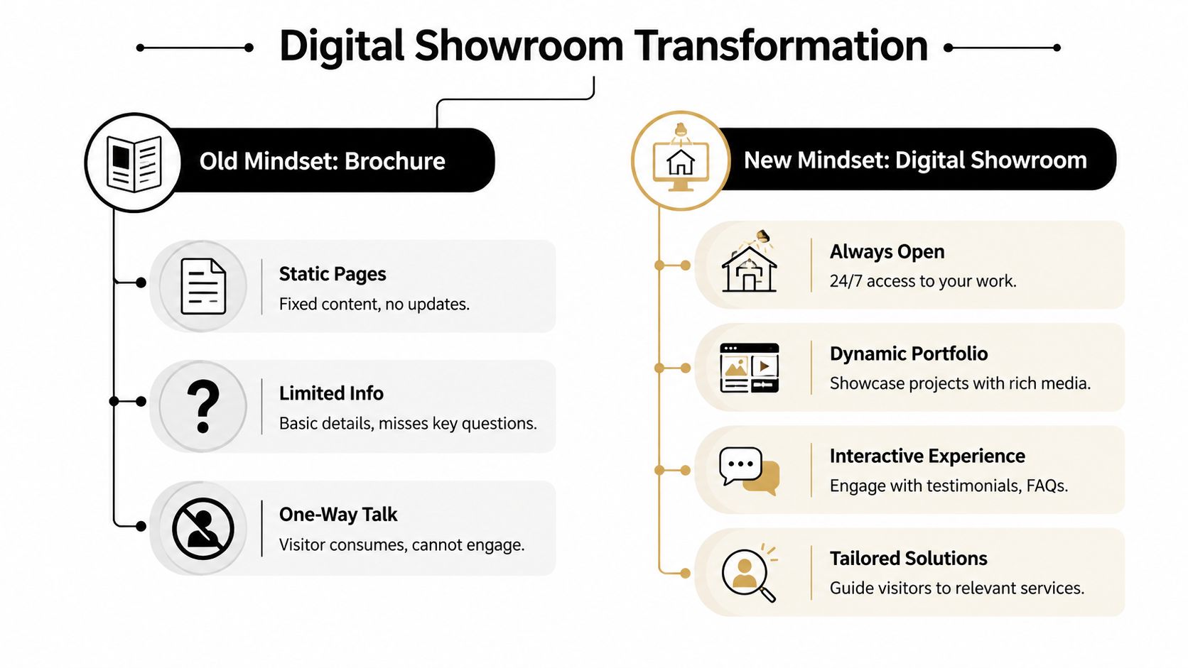
What a brochure does wrong
Brochure sites usually have three problems.
First, they stay vague. They say things like “quality craftsmanship” and “excellent service” without proving anything.
Second, they force the homeowner to do all the work. The visitor has to guess what you specialize in, whether you handle their area, and whether their budget even fits.
Third, they invite low-fit leads because they hide the standards. If you never say what kinds of jobs you take, everyone assumes they should call.
What a digital showroom does right
A showroom site acts more like a guided walk-through. It gives each part of your business a job.
Here's the simple version:
| Website area | What it should do |
|---|---|
| Homepage | Make the company feel credible and relevant fast |
| Service pages | Help homeowners match their problem to your solution |
| Portfolio | Prove you can execute the kind of work you claim |
| About page | Show the humans, standards, and process behind the brand |
| Contact path | Help qualified people take the next step without friction |
Your website should repel bad-fit jobs
This is the part most agencies skip because they're obsessed with “more leads.”
For higher-ticket remodeling, that mindset is lazy. You don't need more random forms from people who want a cheap refresh and a fast estimate. You need better sales conversations.
One of the more useful points in this article on construction company web design and growth is that the better question isn't “How do we get more leads?” It's how to make the right leads self-identify. That matters even more for large-ticket projects, where clear project-size ranges, service-area boundaries, budget expectations, and process detail can save serious time.
Your site should feel like a clean showroom with a front desk, not a pile of flyers on a folding table.
If a homeowner wants a premium remodel and sees a site that clearly explains your process, shows real work, and signals the level you operate at, they lean in. If they want a bargain-bin job and your site clearly communicates otherwise, they back out. Good. That's the point.
The 5 Must-Have Pages for a Remodeler's Website
If your website were a house, these are the load-bearing walls. Miss one, and the whole thing gets shaky.
Homepage
The homepage has one main job. Tell the right homeowner they're in the right place.
That means clear positioning near the top. Not “welcome to our website.” Say what you do, where you do it, and what kind of projects you're built for.
A strong homepage usually includes:
- A clear headline: Example, kitchen remodeling, whole-home renovation, or additions in your market.
- Proof near the top: Real project photos, short testimonials, review snippets, badges, or signs of legitimacy.
- A visible next step: Consultation request, project inquiry, or discovery call.
- Signals of fit: Service area and the type of remodeling work you want.
Service pages
Service pages are your floor plans. Each one should speak to one homeowner need clearly.
Don't hide everything under one generic “Services” page. If you remodel kitchens, bathrooms, additions, and outdoor spaces, each one deserves its own page. That helps the homeowner and it helps search visibility.
A good service page answers child-simple questions:
- What is this service?
- Is this what I need?
- Can this company do it well?
- What happens if I contact them?
Portfolio page
This is your proof shelf. If the photos are weak, outdated, or random, the whole sales story falls apart.
Use real projects. Show finished work people care about. Organize the work by type so a homeowner interested in a kitchen doesn't have to dig through patios and powder rooms.
Five strong, relevant projects beat a giant junk drawer of mixed photos.
Each featured project should do more than show pretty pictures. Add a little context. What kind of home was it? What problem did the client want solved? What style or scope did the project involve? You don't need a novel. Just enough to show you know how to solve real problems.
About page
Owners often treat the About page like an afterthought. Big mistake.
Homeowners hiring for a major remodel aren't just buying tile, cabinets, or framing. They're buying trust. They want to know who's leading the company, how you think, and whether your team feels steady and professional.
Your About page should include things like:
- Your story: Why the business exists and how you work
- Your people: Real team photos beat stock images every time
- Your standards: Design-build approach, communication style, craftsmanship philosophy
- Your process: How projects move from first call to final walkthrough
Contact page
This page shouldn't be a dead end. It should feel like a staffed front desk.
Keep it clean. Make it obvious how to reach you. Tell people what happens after they submit. Add a short form that helps with qualification instead of inviting generic tire-kicking.
A better contact form asks useful questions like project type, location, and goals. It doesn't need to interrogate people. It just needs to help your team tell the difference between a serious remodeling prospect and someone looking for a tiny handyman task.
Designing for Trust and Action Not Just Looks
Pretty doesn't close jobs. Clear does.
A good-looking website helps, but only if the design makes the homeowner feel safe taking the next step. Online trust works like jobsite organization. When the site feels clean, ordered, and intentional, people assume the company runs that way too.
Trust is built from small signals
Most homeowners won't say, “I dislike your visual hierarchy.” They'll just leave.
They're reacting to simple things. Are the photos real? Can I tell what this company does? Do the buttons make sense? Does this feel current? Can I contact them without hunting?
Here are the trust signals that matter most in practice:
- Real photography: Use your work, your team, your projects. Stock images weaken confidence.
- Client proof: Testimonials, reviews, and project-specific feedback reduce fear.
- Clear calls to action: “Request a consultation” works better than vague button text.
- Simple layout: Don't make people solve a puzzle to find basic information.
A lot of remodelers also underestimate how much reviews influence the whole trust picture. This look at whether Google reviews help SEO is useful because reviews don't just support rankings. They support conversion too, especially when they're paired with strong design.
Mobile is not the side version
Many contractor sites still treat mobile like the leftover version. That's a mistake. A homeowner often finds you on a phone first, while sitting on the couch, standing in the house, or comparing companies quickly.
According to Design Hero's construction web design guidance, contractor websites are often image-heavy, a majority of visitors arrive on mobile devices, and slow load times directly increase bounce rates and reduce quote requests. Their practical recommendation is mobile-first performance. Compress project photography, cut plugin and script bloat, use caching and fast delivery, and build for handset-sized screens first.
That means:
- Scale images properly: Don't shove giant project photos into a phone screen.
- Trim unnecessary tools: Every extra plugin, tracker, or animation can slow the site down.
- Test the actual experience: Open the site on an actual phone, not just a desktop preview.
- Keep buttons thumb-friendly: If a homeowner has to zoom in, the design failed.
A fast mobile site feels like a well-run crew arriving on time with the right tools. A slow one feels like no one's in charge.
Action should feel easy
Once trust is there, action should be obvious.
Don't ask people to decode your intent. If you want consultations, say that. If you want larger-scope projects, frame the call to action around planning, design-build, or project discovery. Your design should lead the eye like a good walkthrough. One next step at a time.
How the Right Homeowners Find You on Google
A great website on its own is like building a showroom at the end of an unmarked dirt road. If homeowners can't find it, it won't help much.
For a remodeler, Google is the town's main street. You want your company to show up when the right local homeowner searches for the exact thing you build.

Local search starts with clear structure
You don't need magic tricks. You need clear signals.
Google and other search systems are trying to answer basic questions: what do you do, where do you do it, and why should anyone trust you? If your website is messy, vague, or thin, those systems struggle to match you with the right searches.
The basics look like this:
- Service pages: One page for each major remodeling service
- Location signals: Clear service-area info throughout the site
- Consistent business details: Same company details across your website and profiles
- Helpful page structure: Headings, FAQs, and supporting content that answer real questions
If you want a practical walk-through of the local side, this guide on optimizing your remodeling website for local search is a useful reference.
Google Maps matters, but so does AI discovery
Search behavior is changing. People still use Google Maps and standard search results, but more answers are now pulled into AI-generated summaries.
That shift matters for contractor website design. Mad Mind Studios' article on general contractor websites that convert points out that Google's AI Overviews expanded to over 100 countries and reached more than 1 billion monthly users by May 2025. Their practical takeaway is straightforward. Contractor websites should use clear page structures, FAQs, and schema markup so AI systems can extract services, service areas, and proof assets accurately.
Simple way to think about SEO
Think of SEO like putting signs on the roads leading to your shop.
If the signs are clear, the roads are paved, and the building is labeled correctly, the right people arrive. If the signs are confusing, missing, or point in ten directions at once, traffic passes by.
The best SEO pages don't sound robotic. They sound clear enough that both a homeowner and a machine can understand them.
For premium remodeling leads, the goal isn't to rank for everything. It's to rank for the work you want in the areas you serve.
Connecting Your Website to Your Business System
A website by itself is just a front door. If there's nothing behind it, leads pile up on the porch.
The smarter move is to connect the site to the way your business already runs. That's where contractor website design stops being decoration and starts acting like infrastructure.
Your CRM is the job folder
Think of a CRM as the digital version of a perfect project binder. Every lead goes in. Notes stay attached. Follow-ups don't disappear under truck seats or inside someone's memory.
When a homeowner fills out a form, calls, or books a consultation, that information should land in one place your team can use. Not in a random inbox. Not on sticky notes. Not split across three apps.
A connected setup helps you do simple but important things:
- Track every inquiry: Know who contacted you and when
- Assign follow-up: Make sure someone owns the next step
- Store context: Budget, project type, location, and timing stay attached to the lead
- Prevent dropped opportunities: Missed calls and forgotten forms stop costing you work
Booking and forms should screen people
At this point, qualification becomes real.
A contact form shouldn't just collect a name and email like it's 2012. It should help sort homeowners into buckets. Right fit, maybe fit, not fit.
Ask simple questions that help your team prepare:
| Intake element | Why it helps |
|---|---|
| Project type | Routes kitchen leads differently than additions or whole-home jobs |
| Location | Filters out work outside your service area |
| Timeline | Distinguishes active buyers from casual browsers |
| Project details | Gives your team enough context for a better first call |
You don't need a giant form. You need a useful one.
Analytics is the scoreboard
Most owners either ignore analytics or stare at the wrong numbers. They look at traffic and bounce around in reports, but they can't answer the only questions that matter.
Which pages bring in serious inquiries? Which services get attention? Where do leads stall? Which calls to action get used?
That's the scoreboard. Not vanity metrics. Not pretty charts.
One practical option on the operations side is a system like Constructo Marketing's whitelabeled GoHighLevel CRM, which the company uses to track leads, automate follow-up, and trigger missed-call text-back for contractors. It's one example of how the website can connect to sales follow-up instead of dumping leads into a black hole.
If your site generates leads but your team can't track, route, and respond to them cleanly, the website isn't the real problem anymore. The system behind it is.
Your Action Checklist for a High-Converting Website
A homeowner lands on your site after seeing your work. They like the photos. Then they leave because they still cannot tell one thing. Are you the right fit for their project, or not?
That is the test.
If you want better remodeling leads, review your website the same way you review plans before the crew starts. Look for gaps, vague specs, and anything that creates confusion. A good site should help the right homeowner raise their hand and help the wrong one bow out before your team burns an hour on the phone.
For $75K-plus projects, your website has to do more than collect form fills. It needs to prequalify. It should make your project range, service area, process, and standards obvious enough that serious buyers keep going and price shoppers self-select out.
Messaging and positioning check
Start at the top.
- Does the homepage clearly say what kinds of projects you take on
- Does it show the price point or project scope you are built for
- Does it name the cities or neighborhoods you serve
- Does the copy sound like an established remodeler, not a general catch-all shop
Broad messaging creates broad leads. If your site says you do everything for everyone, you will hear from everyone. Including the people you do not want.
Qualification check
At this point, your site saves your estimator and sales team from bad-fit calls.
- Do you say what project types are a strong fit
- Do you explain your process so serious homeowners know what working with you looks like
- Do you set expectations around planning, budget, or timeline
- Do you politely screen out small jobs, out-of-area work, and unrealistic inquiries
Good qualification usually reduces junk leads. That is a win. Ten random inquiries are not better than three homeowners ready for a real conversation.
Trust and usability check
Now walk the site like a homeowner comparing you to two other remodelers on a phone at 9 p.m.
- Can they see strong project photos right away
- Can they find proof that clients trusted you with expensive work
- Can they understand your process without digging
- Can they contact you in under a minute
- Does the site feel current, organized, and easy to use on mobile
Sloppy websites send the same signal as a sloppy jobsite. Homeowners notice.
Search and system check
Last, check whether the site supports the business behind it.
- Do you have dedicated pages for each major service
- Is the site structure clear enough that Google can match you to the right searches
- Do inquiries go into a CRM or organized follow-up system
- Can your team tell which pages bring in qualified leads, not just traffic
A high-performing website acts like a filter. It builds confidence with the right homeowners and creates enough friction to push away the wrong ones.
If your current site fails this checklist, stop adding polish to a weak foundation. Tighten the message, raise the bar for who should contact you, and make the next step clear.
If you want a website that helps attract qualified remodeling opportunities instead of wasting your team's time, Constructo Marketing builds contractor websites as part of a broader system that includes Local SEO, AI-driven SEO, Google Ads, and CRM-backed follow-up for remodelers targeting larger residential projects.