

Your website isn't a brochure. It's your best salesperson.
A homeowner clicks your Google Ad for a kitchen remodel. They're ready to spend real money. Maybe it's a full first-floor renovation. Maybe it's a luxury primary bath. Maybe it's a dream kitchen they've wanted for years. They land on your page, and in a few seconds they decide one thing: “These people get me” or “I'm backing out.”
That moment matters more than most remodelers realize. If your page looks busy, confusing, generic, or thin on proof, the visitor leaves. They don't call to explain why. They just hit the back button and keep shopping. In remodeling, that lost click can be a lost six-figure project.
A good landing page fixes that. It doesn't try to be everything. It acts like a great in-home sales rep. It greets the homeowner, shows the right work, answers the big fears, and gives one clear next step.
That's the game with landing page best practices. You're not decorating a webpage. You're building a path from “I'm curious” to “I trust you enough to talk.”
If you target high-value projects, trust matters as much as traffic. People spending that kind of money want clarity, proof, process, and confidence. Give them that, and your page starts pulling its weight.
Table of Contents
- 1. A Headline That Hooks Them in 3 Seconds
- 2. Show, Don't Just Tell, With Great Pictures and Videos
- 3. Build Trust With Reviews and Badges
- 4. A Super Simple Contact Form
- 5. A Big, Obvious 'Next Step' Button (CTA)
- 6. Make It Fast and Easy on a Phone
- 7. Speak Google's Language (SEO Basics)
- 8. Match Your Page to Your Google Ad
- 9. Test and Measure What Works
- 10. Connect It to a Smart System (CRM)
- Landing Page Best Practices: 10-Point Comparison
- Stop Guessing, Start Converting
1. A Headline That Hooks Them in 3 Seconds

Your headline is the sign on the front of the store. If it's vague, people keep walking.
“Welcome to Our Company” is weak. “Luxury Kitchen Remodeling in Austin” is clear. “Whole-Home Renovations for Families in North Shore” is clear. A homeowner should know what you do, who it's for, and where you work without thinking hard.
For high-ticket remodeling, general headlines hurt you. People spending serious money don't want a jack-of-all-trades page. They want a specialist page. If they clicked an ad for kitchen remodeling, don't greet them with “Home Improvement Solutions.” That sounds like a handyman site.
Say What You Do Right Away
Write headlines that answer three little questions:
- What are you selling: Kitchen remodels, additions, whole-home renovations, outdoor living.
- Who is it for: Busy families, luxury homeowners, aging-in-place clients.
- Where do you work: Your city, county, or neighborhood cluster.
A better headline sounds like this:
- Service first: “Custom Kitchen Remodeling in Charlotte”
- Audience first: “High-End Bathroom Remodels for Seattle Homeowners”
- Location first: “Naperville Home Additions Designed and Built Under One Roof”
Practical rule: If a 10-year-old can't tell what you do from the headline, rewrite it.
Landing page best practices start here because everything else sits under that first promise. Your headline pulls the visitor in or pushes them away. Don't try to sound clever. Try to sound useful.
A real-world example: if your ad targets “garage conversions in Phoenix,” your headline should say “Garage Conversion Contractor in Phoenix” or something close to it. Not “Transforming Homes With Excellence.” That second line sounds nice, but it doesn't close the gap between click and trust.
2. Show, Don't Just Tell, With Great Pictures and Videos
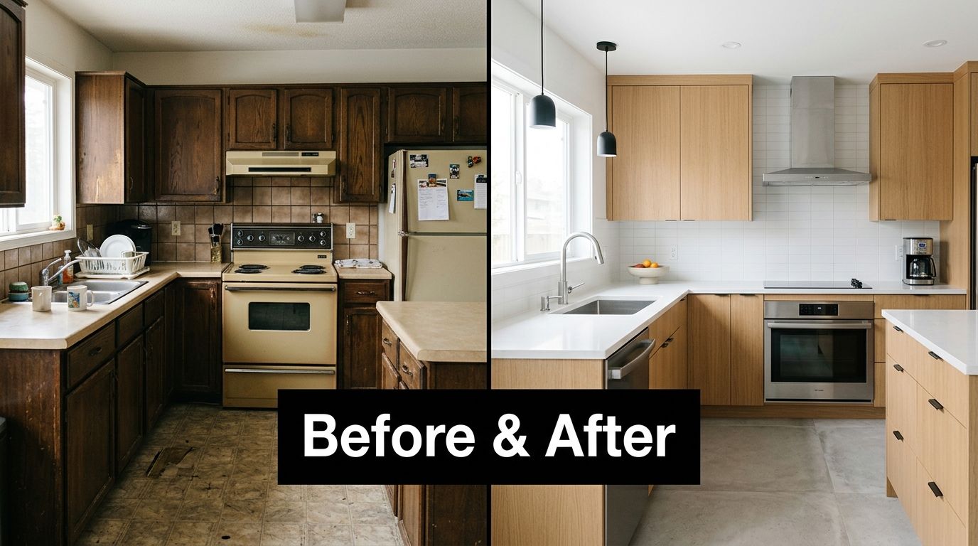
People won't spend big money based on adjectives. “Beautiful.” “Quality.” “Premium.” Those words are cheap. Photos are proof.
If you remodel kitchens, show kitchens. If you build additions, show additions. If you target luxury work, your page should look expensive before the homeowner reads a word. Grainy phone photos and stock images kill trust fast.
Before-and-after photos work especially well because they show the jump from problem to outcome. A dated bath becomes a spa-like primary suite. A cramped kitchen becomes an open gathering space. That story lands fast.
Use Visual Proof, Not Fluff
Your visuals should do jobs, not just fill space.
- Lead with the best project: Put your strongest image near the top.
- Show the right type of work: Match the gallery to the service on the page.
- Use process visuals too: Include design boards, framing progress, and finished details.
- Add short video tours: A simple walkthrough builds confidence better than another paragraph.
A good example is a bathroom remodel page that opens with one polished finished shot, then follows with a short project tour, then shows a few detail images of tile work, vanity lighting, and layout improvements. That sequence helps the visitor say, “Yes, they can handle my project.”
If you want ideas for what to film, use these video content ideas for remodeling clients.
Don't overload the page with random images from every service you offer. If the page is about kitchen remodeling in one market, keep the visuals on that track. Strong landing page best practices keep the page focused. Your gallery should support the sale, not distract from it.
Homeowners believe what they can see faster than what they can read.
3. Build Trust With Reviews and Badges
Big remodels scare people. That's the truth.
Homeowners worry about cost overruns, missed deadlines, poor communication, dust, mess, and crews they don't trust in the house. Your landing page needs to calm those fears quickly. One of the simplest ways is to show that other people already trusted you and were glad they did.
That means real reviews, real credentials, real associations, and real proof of professionalism. Not a giant paragraph saying you care about quality. Every remodeler says that.
Make Them Feel Safe
Put trust signals where people can see them before they hit the form.
- Use review snippets: Pull short, readable testimonials from Google or other real review platforms.
- Show names when allowed: First name, last initial, and town feel more believable than “Happy Customer.”
- Display badges that matter: BBB, NARI, NKBA, Houzz, local awards, manufacturer certifications.
- Add team credibility: Licensed, insured, design-build, in-house project management, years serving your market.
A smart layout for a high-value landing page often includes a review section near the top, then project photos, then a short process section, then more proof lower down. That works because expensive services need confidence, not just speed.
One reason this matters so much in remodeling is that strict minimalism can backfire. Guidance from Unbounce on landing page best practices points out a useful nuance for high-consideration services. Keep one main CTA, but include enough galleries, credentials, FAQs, and process details to reduce risk.
That's the sweet spot. Don't clutter the page. But don't starve it either.
If a homeowner is about to invite you into a six-month project, they need more than a button. They need reasons to believe you're the safe choice.
4. A Super Simple Contact Form
When someone is ready to reach out, don't make them do homework.
A long form feels like paperwork before trust is fully built. That's a bad trade. At this stage, your job is to start the conversation, not force the homeowner to map out the entire project before you've even said hello.
For most remodeling landing pages, fewer form fields work better than more. Best-practice guidance from Directive Consulting on focused landing pages stresses a short, measurable conversion path and forms limited to essential fields. That advice fits remodeling well.
Ask for Less to Get More Leads
Start with the basics. You usually need:
- Name: So you know who you're speaking with.
- Email or phone: So you can reply fast.
- Project type: So you can route the lead correctly.
That's enough for many campaigns. You can ask for budget, address, inspiration photos, and timeline later, after contact starts.
A real-world example: someone clicks an ad for “home addition contractor in Denver.” They're interested, but cautious. If your form asks for square footage, permit history, full address, ideal start month, budget range, and referral source, many people will stop. If the form says “Name, email, phone, tell us about your project,” more of them will raise their hand.
A short form is an open door. A long form is a locked gate.
Also make the form easy to spot. Put it near the top and again farther down the page. Use plain labels. Don't use tiny fields. Don't use weird placeholder text that disappears once they click.
Among landing page best practices, this one is simple. If the next step feels hard, fewer people take it.
5. A Big, Obvious 'Next Step' Button (CTA)
Every landing page needs one main job. One.
Not three. Not five. One.
If the page asks people to book a call, browse your gallery, download a guide, read your blog, follow you on Instagram, and explore your service area pages, you've built a traffic circle. People go in circles and leave.
A focused page usually performs better. One 2026 industry roundup reports that pages with one primary CTA or link convert around 13.5% on average, while pages with five or more links convert about 10.5% on average. The same roundup says landing pages average about 6.6% conversion across industries, which is why marketers keep stripping away distractions and pushing one clear action on the page, according to Involve's landing page statistics roundup.
Give Them One Job to Do
Your CTA should tell the visitor exactly what happens next.
Good CTA examples for remodelers:
- Book a consultation: “Schedule My Design Consultation”
- Request an estimate: “Get My Remodeling Estimate”
- Start the conversation: “Talk to Our Remodeling Team”
Weak CTA examples:
- Generic: “Submit”
- Vague: “Learn More”
- Flat: “Click Here”
Make the button easy to find. Use a color that stands out from the rest of the page. Repeat the button in logical spots. Keep the wording consistent from top to bottom.
A kitchen remodeling page should not open with “Get a Free Consultation” and end with “Request More Information” and then switch again to “Contact Us.” Pick one phrase and stick with it. That consistency lowers friction.
For a homeowner considering a large renovation, your CTA is the handshake. Make it clear, specific, and easy to trust.
6. Make It Fast and Easy on a Phone
Most remodelers still review pages on a desktop and forget how the page feels on a phone. That's a mistake.
A homeowner might find you while sitting on the couch after dinner, standing in the school pickup line, or scrolling during a work break. If your page is hard to read, slow to load, or annoying to tap, you lose them before the page gets a fair shot.
The mobile version can't be a squeezed-down desktop page. It has to feel natural on a small screen.
Phone First Wins
Test your page like a homeowner, not like a marketer.
- Tap the button with your thumb: If it's tiny or buried, fix it.
- Read the headline on a small screen: If it breaks awkwardly, tighten it.
- Check the form: If it feels like a chore on mobile, trim it.
- Compress heavy images: Large project photos are good. Oversized files are not.
- Keep the top clean: Headline, proof, CTA. Don't make people dig.
A real-world remodeling example: a luxury outdoor living page may look beautiful on a laptop with wide panoramic images. On a phone, that same hero image can push the CTA too far down and hide the headline. Crop it tighter. Reduce visual height. Get to the point faster.
Phone usability is one of the most practical landing page best practices because it directly affects lead flow. A slow, awkward page doesn't just look bad. It wastes ad spend and organic traffic.
Use your own phone. Open the page. Fill out the form. If you get annoyed, your prospects will too.
7. Speak Google's Language (SEO Basics)

SEO sounds fancy, but the basic idea is simple. Use the same words your customer uses.
If homeowners search “kitchen remodeler in Austin,” your page should say “kitchen remodeler in Austin.” Not only “culinary space transformation” or some other made-up marketing phrase. Google wants clear matches. So do people.
This matters even more when you build service-specific and location-specific pages. A general page won't rank and convert as well as a page built for one service in one market with one action.
Use the Words Homeowners Type
Put your target phrase in the places that matter most:
- Page title: Say the service and location clearly.
- Main headline: Match the core search intent.
- Body copy: Use natural variations without stuffing.
- Image alt text: Describe the actual project shown.
- Button copy: Keep the service language consistent.
A practical example: if you want leads for bath remodels in Raleigh, build a page around that phrase and support it with photos of bath projects, bathroom-specific testimonials, and copy about your bathroom process. Don't cram kitchen, additions, roofing, siding, and windows into the same page.
If you want a deeper playbook, this SEO guide for remodelers lays out the bigger picture.
The simplest version is this. Google is a matchmaker. If your page clearly matches the search, you've got a better shot at showing up and converting the click once it arrives.
8. Match Your Page to Your Google Ad
If your ad says one thing and your page says another, trust breaks.
This is called message match. It means the promise in the ad should carry straight into the page. Same offer. Same audience. Same service. Same main action. When that match is tight, the visitor feels like they landed in the right place.
When the match is sloppy, they hesitate. And hesitation kills leads.
Keep the Promise Consistent
Let's say you run a Google Ad for “Bathroom Remodeling in Scottsdale.” The landing page headline should not switch to “Whole-Home Renovation Experts.” That forces the visitor to stop and ask, “Did I click the wrong thing?”
Better flow:
- Ad: “Scottsdale Bathroom Remodeling”
- Headline: “Bathroom Remodeling in Scottsdale”
- Button: “Schedule My Bathroom Consultation”
That kind of consistency is a core part of modern landing page best practices. Both Directive Consulting and Mailchimp guidance emphasize aligning the ad promise with the page headline and CTA language so the path feels clear and qualified. This is especially useful for remodelers running separate campaigns for kitchens, baths, additions, or outdoor living.
A campaign-specific page should feel like the ad continued. Same lane. Same promise. Same next step.
If the ad says apples and the page says oranges, the homeowner leaves.
This also helps internal teams. Your sales staff can answer faster because the lead source is clearer. If someone came through a page built for kitchen remodels in one city, your follow-up can be customized from the first call.
9. Test and Measure What Works
Don't treat your landing page like a finished monument. Treat it like a jobsite. You improve it as you go.
The first version is rarely the best version. Sometimes a different headline wins. Sometimes a shorter form wins. Sometimes swapping the hero image brings in better leads. You won't know by guessing.
The best operators test, watch, adjust, and repeat.
Build, Test, Improve
A 2026 guide recommends setting SMART goals for landing page work, such as increasing conversions by 15% in three months or generating 500 leads per month, then validating changes through A/B testing and analytics tracking. The same guide also notes that moving from roughly 10 landing pages to 15 can produce a 55% increase in leads, and that companies with 40 or more landing pages can generate 500% more leads than businesses with fewer than 10 pages, according to Mailjet's landing page optimization guide.
That matters for remodelers because one page shouldn't try to do every job. Build separate pages for:
- kitchens
- bathrooms
- additions
- whole-home remodels
- outdoor living
- key cities or neighborhoods
Then test elements inside each one.
Try simple tests first:
- Headline test: Service-first headline versus outcome-first headline.
- CTA test: “Book a Consultation” versus “Request an Estimate.”
- Proof test: Review section higher on the page versus lower.
- Hero test: Finished-project image versus before-and-after image.
A practical example: if your kitchen page gets traffic but weak form fills, test a stronger headline and move your best review above the form. Small changes can produce better conversations and better-fit leads.
Good landing page best practices aren't static. The page should learn.
10. Connect It to a Smart System (CRM)
A lead is only valuable if your team acts on it.
Too many remodelers let website leads drift into a shared inbox, sit for hours, and get answered late. By then the homeowner has already contacted two or three competitors. The first solid response often gets the appointment.
Your landing page shouldn't dump leads into chaos. It should hand them to a system.
Speed Matters After the Form Fill
Connect the page to a CRM like GoHighLevel so the handoff happens automatically. When someone fills out the form, your system can notify your team, trigger a follow-up, log the source, and keep the conversation moving.
A basic setup for a remodeler looks like this:
- Instant capture: The form sends the lead into the CRM immediately.
- Fast notification: Sales staff gets an alert right away.
- Auto-response: The homeowner gets a confirmation email or text.
- Pipeline tracking: You can see whether the lead was contacted, qualified, and booked.
If you want to compare platforms and setup ideas, this guide to CRM software for builders is a good starting point.
Here's a real-world scenario. A homeowner fills out your addition page at 8:30 p.m. If your system sends a clean confirmation, logs the project type, and tees up next-morning follow-up, you look organized. If the message disappears into someone's inbox and gets answered two days later, you look risky.
That's why the best landing page best practices don't stop at design. The back end matters too. A smart page plus a smart system gives you a much better chance of turning clicks into consultations.
Landing Page Best Practices: 10-Point Comparison
| Item | Implementation Complexity | Resource Requirements | Expected Outcomes | Ideal Use Cases | Key Advantages |
|---|---|---|---|---|---|
| A Headline That Hooks Them in 3 Seconds | Low (copy-focused) | Copywriter, basic design | Faster understanding; lower bounce | First impression; landing pages | Immediate clarity; communicates service/location/value |
| Show, Don't Just Tell, With Great Pictures and Videos | Medium (production work) | Photographer/videographer, editor | Stronger desire; higher trust & conversions | Portfolio-driven, high‑ticket projects | Visual proof of quality; emotional appeal |
| Build Trust With Reviews and Badges | Low–Medium (content aggregation) | Review collection, badge assets | Increased credibility; reduced hesitation | Risk‑averse clients; expensive jobs | Social proof; third‑party validation |
| A Super Simple Contact Form | Low | Form builder, mobile optimization | More lead submissions; less drop-off | Mobile users; initial contact capture | Low friction; higher conversion rate |
| A Big, Obvious 'Next Step' Button (CTA) | Low | Design and copy tweaks | Higher click-throughs; clearer funnel | Conversion-focused pages | Guides user action; improves conversions |
| Make It Fast and Easy on a Phone | Medium–High (performance work) | Developer, testing, fast hosting | Lower bounce; better rankings; more leads | Mobile-first audiences; local search | Faster UX; improved SEO and retention |
| Speak Google's Language (SEO Basics) | Medium | Keyword research, SEO copy, metadata | More organic, targeted traffic over time | Long-term lead generation | Free targeted traffic; local visibility |
| Match Your Page to Your Google Ad | Low–Medium | Ad/landing coordination, copy alignment | Higher ad quality score; better conversions | Paid search campaigns | Consistency; lower ad costs; trust on click |
| Test and Measure What Works | Medium | Analytics/A/B tools, time for experiments | Improved conversion rates over time | Performance-driven optimization | Data-driven decisions; continual ROI improvement |
| Connect It to a Smart System (CRM) | Medium–High | CRM subscription, setup, automation work | Faster follow-up; higher close rates | Scaling businesses; high-value leads | Automated follow-up; organized lead management |
Stop Guessing, Start Converting
A landing page isn't just a web page. It's a sales tool.
That means every part of it needs a job. The headline should tell people they're in the right place. The photos should prove you can do the work. The reviews should calm the fear. The form should be easy. The button should be obvious. The mobile experience should feel smooth. The SEO should match what people search. The ad and page should say the same thing. The system behind the page should catch every lead and move fast.
That's how you stop leaking opportunities.
A lot of remodelers make the same mistake. They send paid traffic to a homepage. Or they build one generic service page and expect it to work for every market, every project type, and every homeowner. That's like sending every lead into the same messy showroom and hoping they find what they need. Some will. Most won't.
You'll get better results when each landing page has one clear promise and one clear audience. Kitchen page for kitchen buyers. Bath page for bath buyers. Addition page for families who need more room. One city. One service. One next step.
Keep it simple enough for a child to understand. That's not dumbing it down. That's sharpening it.
If a homeowner lands on your page, they should be able to answer these questions fast:
- What do you do?
- Do you do it where I live?
- Can I trust you?
- What do I do next?
If the page answers those four questions clearly, you're in good shape.
If it doesn't, fix that before you buy more ads, write more blogs, or chase more traffic. More traffic to a weak page just means more wasted opportunity.
Start with one page this week. Pick your most profitable service. Tighten the headline. Replace weak images. Cut the form down. Add reviews. Make the CTA clearer. Check it on your phone. Connect it to your CRM. Then watch what happens.
Good landing page best practices don't just bring in more leads. They bring in better leads. People who understand your offer, trust your process, and are more ready to have a serious conversation about a serious project.
That's the kind of page a remodeling business needs. One that works while you're in the field, in a sales call, or at home with your family. One that earns trust before your phone even rings.
Constructo Marketing helps remodelers turn clicks into qualified opportunities with focused landing pages, strong SEO, Google Ads, and CRM automation built for high-value residential projects. If you want a system that helps you win better-fit leads in the $75K to $300K range, talk to Constructo Marketing.