

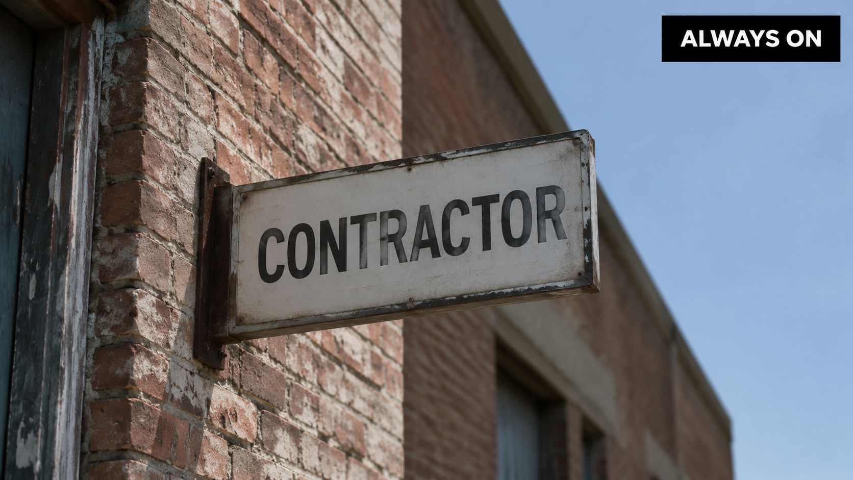
You've probably done this yourself. You'll spend serious money on trucks, wraps, photography, a clean showroom, maybe even a polished website, then treat the outside sign like a parking lot label. Name. Logo. Done.
That's backwards.
If you're chasing high-value remodeling work, your sign isn't decoration. It's a local lead asset. It works when your office is closed, when your sales team is off, and when a homeowner drives by wondering who in town looks established enough to trust with their kitchen, addition, or whole-home project. Good outdoor signs for business pull attention, build trust fast, and create one more path into your pipeline. Bad signs sit there and waste frontage.
Most sign advice stops at materials, fonts, and permits. That matters, but it misses the business question: is this sign producing leads and revenue, or is it just taking up space? That's the lens you should use for every decision.
Table of Contents
- Why Your Sign Is Your 24/7 Salesperson
- Planning Your Sign for Leads Not Just Looks
- Designing a Sign People Actually Read
- Navigating Permits and Finding a Good Sign Company
- Installation Tips and Avoiding Common Mistakes
- How to Know If Your New Sign Is Actually Working
Why Your Sign Is Your 24/7 Salesperson
A remodeler knows the value of curb appeal. Homeowners make fast judgments. They do it with houses, and they do it with businesses.
That's why I'm blunt about this. Your sign is either helping you earn trust or making you look smaller, older, or less organized than you really are. A homeowner driving by doesn't know your process, your craftsmanship, or your warranty. They know what they can see in three seconds.
First impressions happen before the first call
A FedEx Office survey cited by Signs.com found that nearly 80% of American consumers have walked into a new business solely because of its outdoor signage. That should get your attention.
If a sign can drive a first visit, it can drive a first call too. For remodeling firms, that matters even more because homeowners often buy based on confidence, not convenience alone. They want to feel that your company is real, stable, and established in their area.
Practical rule: If your sign looks like an afterthought, people assume your business runs that way too.
A lot of owners separate “offline branding” from “real lead generation.” That's a mistake. Strong local marketing stacks together. Your sign creates recognition in the physical world. Your site closes the gap when they search you later. If you want to boost leads with effective website design, your sign should support that effort, not fight it.
Your sign has one job
Not ten jobs. One.
It needs to make the right homeowner think, “These people look legit. I should call them.” That means your outdoor signs for business should do four simple things:
- Show you're established: A clean, well-made sign tells people you're not a fly-by-night operator.
- Tell them what you do: “Remodeling,” “Kitchen and Bath,” “Design-Build,” or whatever your core service is needs to be obvious.
- Make the next step easy: Phone, website, or a simple path to contact.
- Match your brand: If your sign says “cheap” while your projects are premium, you create friction.
A lot of remodelers also have a branding problem, not just a signage problem. If your visual identity is fuzzy, your sign will be fuzzy too. This guide to branding a construction company is worth reviewing before you approve final artwork.
Stop treating it like a nameplate
A nameplate marks a location. A salesperson creates opportunities.
That's the standard. Your sign should sell trust all day, every day, without needing payroll, coffee, or time off. If it can't do that, replace it, redesign it, or reposition it.
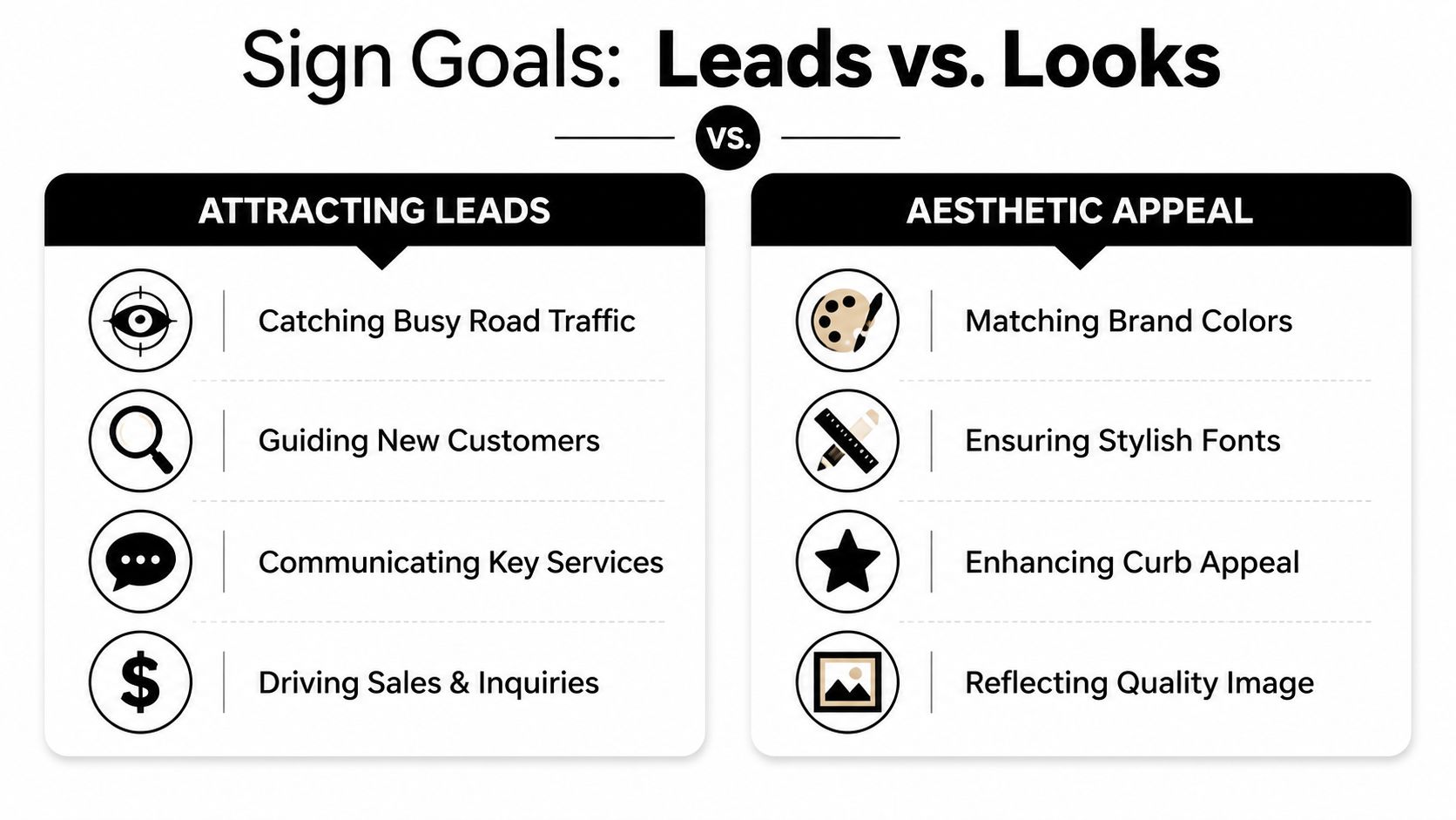
Planning Your Sign for Leads Not Just Looks
Most owners start with colors and logos. Wrong starting point.
Start with the job the sign needs to do. A sign is a tool, just like a miter saw or a laser level. You pick the tool based on the job site, not based on what looks coolest in a brochure.
Pick the sign type by the problem you need to solve
If drivers need to see you from the road, you need one kind of sign. If customers are already on site and need reassurance they're in the right place, you need another.
Here's the simple version:
- Monument signs: Good when your office or showroom sits back from the road. These feel solid and established.
- Channel letter signs: Good on the building face when visibility from the street is decent and you want a cleaner architectural look.
- Pylon signs: Best when you need height and visibility in busier corridors.
- Window graphics or decals: Useful for reinforcing the message when people are already close.
If you serve a defined geographic area, your sign should also support your local visibility strategy. This article on location-based marketing lines up well with that thinking.
Leads first, beauty second
Pretty signs don't always produce calls. Signs that get remembered do.
For a remodeler, lead-focused signage usually means:
- Fewer words
- Bigger service message
- Better visibility from traffic flow
- A contact option people can use quickly
Aesthetic choices still matter. They just come after function. A beautiful sign nobody notices is a polished mistake.
A sign should look expensive enough to signal quality, but simple enough to read at a glance.
Common sign materials compared
Material choices matter because they affect appearance, maintenance, and how often you'll need to touch the thing again.
| Material | What It Is (Simple Terms) | Best For | Durability |
|---|---|---|---|
| Aluminum-composite | A rigid panel made for outdoor use | Long-term exterior business signs | Strong and weather-resistant |
| Aluminum | Lightweight metal panel | Storefront, directional, and parking-area signs | Strong for outdoor use |
| Acrylic | Smooth plastic with a polished finish | Office-facing or upscale-looking signs | Good when appearance matters |
| PVC | Lightweight plastic board | Shorter-term or lower-stress sign applications | Less ideal for hard outdoor wear |
| Vinyl graphics | Printed adhesive film | Windows, doors, and message layers | Useful as a complement, not always the main structure |
One material choice deserves a direct recommendation. Aluminum-composite is usually the smarter long-term buy for remodelers who want exterior durability without constant headaches. It's practical, clean-looking, and built for weather.
If you want to make a sign trackable without cluttering the design, a small QR add-on can help. Something like this QR code decal with 12 rounded corners works best when it's secondary to the main message, not the headline.
Build the message stack in the right order
Use this order:
- Company name
- What you do
- How to contact you
- Optional secondary prompt, like a website or QR code
Don't reverse it. Homeowners won't decode a clever slogan from a moving car. They need the basics first.
A premium remodeling brand doesn't need a loud sign. It needs a clear one.
Designing a Sign People Actually Read
A sign people can't read is a donation to the sign company.
Owners often get too fancy. They cram in services, awards, phone numbers, logos, badges, and taglines like they're building a brochure. But a roadside sign is not a brochure. It's a fast message for distracted people moving past you.
Use the one-job rule
The sign needs to communicate one core thing fast. Usually that's your company name and your main service category.
A FASTSIGNS readability reference says a common pitfall in 68% of failed commercial sign installations is overcrowding the space with excessive text or images, and it gives the benchmark of one inch of letter height per ten feet of viewing distance.
That rule is dead simple. If drivers need to read your sign from 200 feet away, you need letters about 20 inches high.
Good signs delete more than they add
Most remodelers should remove at least half the content from their first draft.
Keep:
- Company name
- Core service
- One contact path
Cut:
- Long slogan lines
- Every service you offer
- Award clutter
- Tiny logos for trade groups
- Paragraph-style copy
If a driver needs to squint, slow down, or think hard, the sign already failed.
Contrast wins over creativity
Black on white works for a reason. High contrast is easy to process fast.
That doesn't mean every sign must be black and white. It means your text and background need a strong separation. Light gray on beige might look tasteful in a mockup. On a bright day or from across the road, it can disappear.
Your font choice matters too. Bold, simple sans-serif fonts are usually the right call for outdoor signs for business. Decorative scripts belong in logos only if they still read cleanly at distance. Most of the time, they don't.
Here's a simple good-versus-bad test:
- Good: Big company name, clear service line, strong contrast, lots of empty space
- Bad: Tiny text, multiple colors fighting each other, too many icons, too many promises
Don't confuse marketing signage with compliance signage
Some business owners borrow design habits from internal safety signs and warning labels. That can make the layout stiff or cluttered. If you need a reference point for regulated workplace communication, this workplace safety signage guide is useful, but your exterior marketing sign has a different job. It needs to attract and persuade, not just instruct.
A simple checklist before you approve production
Ask these five questions:
- Can someone understand it in a few seconds?
- Can they read it from the farthest likely viewing point?
- Does it say what you do?
- Does it look like a premium company, not a discount flyer?
- Would you still understand it if half the text disappeared?
If you answer no to any of those, fix the design before you print anything.
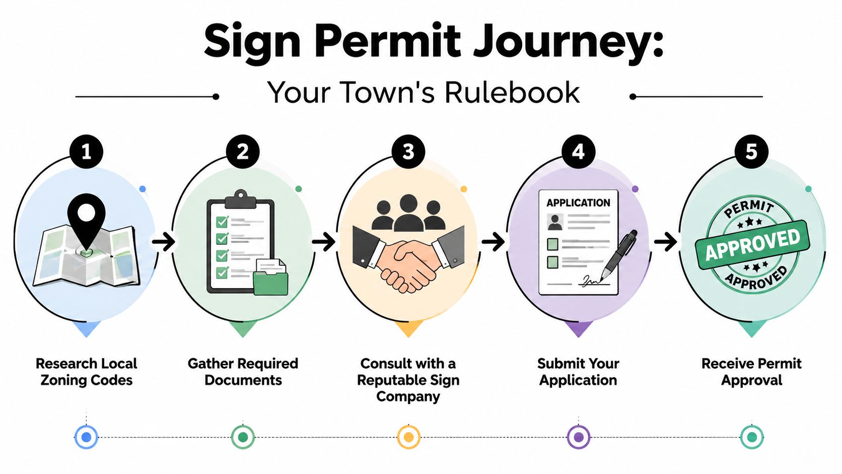
Navigating Permits and Finding a Good Sign Company
This is the part owners love to ignore. Then the city inspector notices the sign, the landlord notices the sign, or the installer blames the fabricator and nobody owns the problem.
Permits are not exciting. They are still part of the job. Treat them like you'd treat structural drawings. Boring is fine. Wrong is expensive.
Your town has a rulebook
Mixed-use corridors and busy commercial areas can get messy fast. Lemberg Electric notes that existing guidance often misses the nuanced risks of compliance in high-traffic or mixed-use areas, where ordinances for setback, height, or illumination can vary dramatically by jurisdiction and lead to costly rework if not addressed upfront.
That means “visible” and “allowed” are not the same thing.
A sign can be easy to spot and still break local rules on:
- Setback
- Height
- Illumination
- Placement relative to roads or neighboring properties
- Building attachment requirements
If you have multiple locations, don't assume one town's approval means the next town will say yes.
Handle permits like a checklist
Keep this process simple:
- Call the city or county planning office
- Ask for the sign ordinance for your property type
- Confirm landlord or center requirements if you lease
- Review illumination, size, and placement limits
- Get permit responsibility in writing with the sign vendor
That last point matters. Owners often assume the sign company handles permits. Some do. Some don't. Some say they do and then dump paperwork back on you halfway through.
Ask one direct question: “Who is responsible for permits, drawings, revisions, and final approval?”
How to spot a good sign company fast
Don't shop on price first. Shop on competence.
A solid vendor should answer these questions clearly:
What outdoor signs do you install most often for businesses like mine?
Their answer tells you if they understand commercial use, not just small decals and banners.Who handles code review and permit submittals?
If the answer is fuzzy, expect problems later.How do you evaluate sightline and placement before fabrication?
A pro thinks about viewing angles, traffic flow, and obstructions before they print anything.
Red flags that should make you walk
You don't need a long list. Three red flags are enough:
| Red flag | Why it matters |
|---|---|
| They promise approval without reviewing local code | They're guessing |
| They only talk design and never mention visibility or placement | They think like decorators, not sign professionals |
| They can't explain installation responsibility | You'll end up managing a mess |
A great sign company should make the process feel organized, not mysterious.
Installation Tips and Avoiding Common Mistakes
A good sign in the wrong place is still a bad sign.
Installation is where strategy meets reality. Trees grow. Delivery trucks park. The sun hits weird angles. A beautiful rendering doesn't show any of that. You need to think like a field superintendent, not just a buyer.
Placement beats preference
Owners often place signs where they want them, not where drivers can see them.
Walk the property from every approach. Drive it at normal speed. Stand where a first-time visitor would stand. Then ask the obvious questions:
- What blocks this sign in real life
- What does it look like in morning and afternoon light
- Can someone read it before they pass the entrance
- Will landscaping, fencing, or parked vehicles kill visibility
If your lot has one strong line of approach, bias the placement toward that approach. Don't try to make one sign do everything from every angle.
Professional installation is worth it
This is not the place to save a few dollars and create a bigger headache.
A Visual Comm summary notes that a prevalent pitfall affecting 45% of outdoor sign projects is inadequate consideration of zoning and municipal codes, leading to 30% of installations requiring costly retrofits, and that selecting durable materials like aluminum-composite can reduce maintenance costs by 40% annually.
That tells you two things. First, installation mistakes often start before the installer arrives. Second, durable material choices pay off after the sign is up.
Common mistakes that hurt performance
These problems show up all the time:
- Blocked visibility: A parked box truck, shrub line, or street furniture kills your sightline.
- Late readability: The sign sits too close to the driveway, so drivers notice it after they've passed.
- Weak lighting: The sign disappears at dusk even though the business still looks open.
- Bad mounting height: Too low gets hidden, too high gets awkward and harder to read.
- Cheap hardware choices: The face still looks fine while brackets, edges, or fasteners start aging badly.
A sign doesn't need to be installed where it looks nicest from your front door. It needs to be installed where prospects can notice it early and read it easily.
Do one post-install walk
As soon as it's up, inspect it on-site.
Drive by. Visit at a different time of day. View it in bad weather if you can. Confirm that it reads cleanly, lights properly, and isn't being blocked. If something is wrong, fix it now. Small visibility problems turn into long-term underperformance.
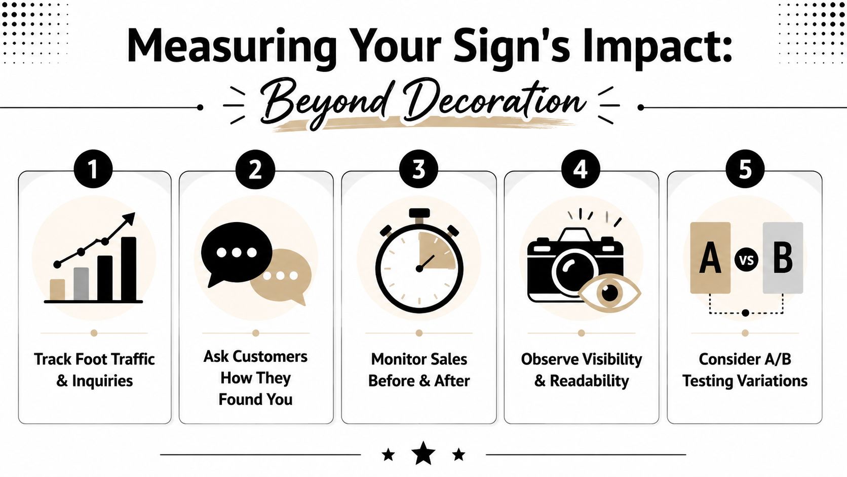
How to Know If Your New Sign Is Actually Working
This is the part that separates smart owners from sentimental owners.
A sign is not successful because you like it. It's successful because it contributes to leads, appointments, and signed jobs. If you don't measure that, you're guessing.
Stop calling it branding and start calling it acquisition
A University of Cincinnati study cited here found that approximately 60% of businesses that updated their outdoor signs reported a measurable improvement in sales, with the average increase in revenue being about 10%.
That's the right frame. A sign can affect revenue. So measure it like an asset, not like wall art.
The simplest tracking system works best
You don't need a giant attribution dashboard to start. You need discipline.
Use this framework:
Put a unique tracking phone number on the sign
Forward it to your main line. Count the calls.Ask every lead one intake question
“How did you hear about us?” Make staff enter the answer every time.Use a dedicated landing page or short URL
Keep it easy to remember and easy to log.Tag sign-sourced leads in your CRM
If you want cleaner reporting later, this matters.Compare before and after
Look at inquiries, showroom visits, and booked consults after the new sign goes live.
What remodelers should really care about
Don't obsess over raw call volume alone. A remodeler selling larger projects needs better signals.
Track:
- Qualified consultation requests
- Showroom or office visits
- Neighborhood recognition
- Lead-to-appointment rate from sign-sourced inquiries
- Closed revenue tied to those leads
A sign that produces fewer but better leads can still be a strong investment.
If you need a cleaner way to think about the numbers, this guide on how to calculate marketing ROI gives a practical foundation.
A plain-English ROI formula
Keep it simple:
- Add up what the sign cost to design, permit, fabricate, and install.
- Track the leads and jobs that clearly came from it.
- Compare the gross profit from those jobs against the total cost.
That's it.
If one good project covers the sign and everything after that is upside, the sign is doing its job. If months go by and nobody can point to a single inquiry, either the sign isn't visible enough, the offer isn't clear enough, or your intake process is too sloppy to attribute it.
The biggest sign ROI mistake isn't buying the wrong sign. It's failing to track the right outcomes after installation.
If you want help turning your local visibility into a system that produces better remodeling leads, Constructo Marketing is built for that. They help remodelers become local-famous with SEO, Google Ads, conversion-focused websites, and CRM tracking that ties marketing activity back to real opportunities, not vanity metrics.